
Address: Wollongong NSW


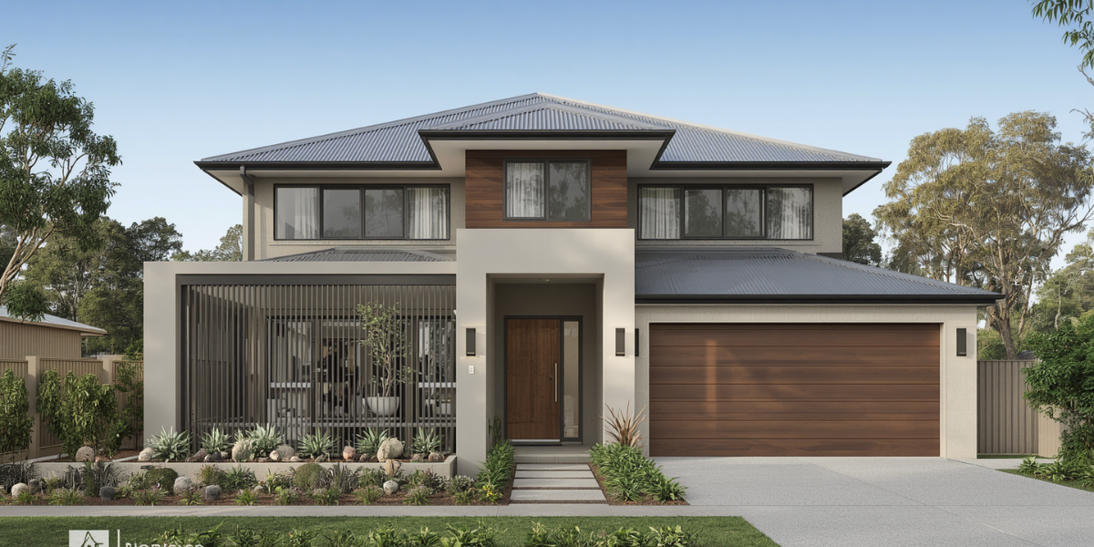
Top Exterior Paint Colours for Wollongong Homes in 2026
Choosing the right exterior paint colours for Wollongong homes is part style, part survival against our coastal light. Choosing an exterior colour for your Wollongong home is a bigger decision than most people think. It’s not just about what looks good on a screen or on a small paint swatch — it’s about what works with your home’s architecture, the surrounding environment, and the specific light conditions you get in the Illawarra.
Here’s what’s trending and what actually works in 2026 for Wollongong and the broader coastal Illawarra. These are the exterior paint colours for Wollongong homes we’re using most this year.
Why Light Changes Exterior Paint Colours for Wollongong Homes
Wollongong homes sit in a distinctive environment — between a dramatic sandstone Escarpment and the blue of the Tasman Sea. Natural light here has a coastal quality that renders colours differently from inland or urban settings. That setting is exactly why exterior paint colours for Wollongong homes behave differently from inland suburbs.
A few things to factor in before settling on a colour:
Bright coastal light washes out pale colours. Tones that look soft and subtle in a paint shop can look almost white against a bright coastal backdrop. Going a shade deeper than you think you need often gives you the result you were actually after. This is the single biggest trap with exterior paint colours for Wollongong homes.
The surrounding landscape is your fixed colour palette. Sandstone, dark-green native vegetation, the grey-blue of the ocean, and terracotta roof tiles are all in the picture. Your wall colour needs to work with these, not fight them. It’s another solid option among exterior paint colours for Wollongong homes.
North and west-facing walls fade faster. Whatever colour you choose, it will fade on sun-exposed aspects. This is especially true in the Illawarra. Premium UV-resistant products like Dulux Weathershield and Haymes Supacryl slow this significantly — but it’s worth considering when choosing between a very dark colour (shows fade faster) and a mid-tone (more forgiving). Fade is the real enemy of exterior paint colours for Wollongong homes, which is why quality paint matters as much as the shade.
Exterior Colour Trends for Wollongong Homes in 2026
1. Warm Sandy Whites and Soft Creams
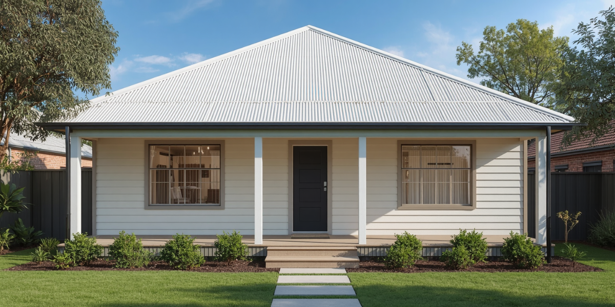
This is the most popular direction for Wollongong homes in 2026 — and for good reason. A warm white or soft cream body colour feels at home in a coastal context, brightens the property without looking harsh, and pairs beautifully with dark or charcoal trim. Warm whites remain the go-to exterior paint colours for Wollongong homes.
Good picks:
- Dulux Antique White USA — a timeless warm white that reads beautifully in coastal light
- Taubmans Linen — soft cream undertone, very versatile
- Haymes Ivory Silk — slightly warmer than a true white, suits both rendered and brick homes
Pair with: Charcoal or deep grey trim on window frames, fascias, and front door for contrast and definition. It’s another solid option among exterior paint colours for Wollongong homes.
2. Coastal Greys and Blue-Greys
Wollongong is a coastal city, and colour palettes that reference the ocean and sky feel genuinely connected to the place. Soft, muted blue-greys are increasingly popular — particularly on rendered homes and contemporary builds. Coastal greys are some of the most reliable exterior paint colours for Wollongong homes.
Good picks:
- Dulux Tranquil Retreat — a sophisticated soft blue-grey that reads very differently throughout the day
- Taubmans Quiet Waters — cooler than grey, warmer than blue, sits beautifully on rendered walls
- Haymes Coastal Fog — mid-tone grey with a very slight blue cast, works well in strong coastal light
Note: Blue-grey tones can shift significantly between morning and afternoon light in the Illawarra. Always test with a sample patch and check it at different times of day.
3. Warm Earthy Tones and Greiges
The in-between space of grey-beige (greige) has been consistently popular because it works in almost any environment. In the Illawarra, the warmer end of this palette — tones that echo sandstone, buff, and dried grass — feels particularly at home. Greige is a safe, modern pick among exterior paint colours for Wollongong homes.
Good picks:
- Dulux Pebble Beach — a warm mid greige, works on brick and render
- Haymes Sandrift — sandy, warm, suits homes with terracotta or mid-tone roof tiles
- Taubmans Coloured Stone — a versatile mid greige that holds well in coastal light
4. Deep Charcoals and Dark Tones (Feature Use)
Dark exteriors — charcoal, near-black, and deep slate — are trending in 2026, particularly on contemporary Wollongong homes. Used as a feature colour on the ground floor of a double-storey, on a garage door, or as a complete exterior scheme on a modern build, these tones are striking. Used carefully, darks are striking exterior paint colours for Wollongong homes.
What to know:
- Dark colours absorb heat significantly — in Wollongong’s warm summers this affects thermal comfort and can stress certain surfaces
- Quality paint with heat-reflective pigment technology (available in some premium dark colours from Dulux and Haymes) reduces this effect
- Dark colours on Colorbond roofing or metal surfaces need specific product specification
Good picks for dark feature use:
- Dulux Monument — a very popular near-black with a very slight warm undertone
- Haymes Graphite — cool dark charcoal, looks sharp on rendered contemporary homes
- Taubmans Ink Well — deep charcoal-navy, particularly good as a front door or feature panel colour
5. Soft Sage and Muted Olive
Green tones on exteriors have moved significantly in 2026. The trend is firmly in the muted, dusty, sage-to-olive range — a palette that connects to the native vegetation of the Escarpment and surrounding bushland.
These work particularly well on Thirroul and Austinmer homes surrounded by native gardens, or on older homes in established streets.
Good picks:
- Dulux Wilderness — a muted blue-green that suits timber homes beautifully
- Haymes Dried Thyme — soft olive-grey, works with both terracotta and grey roofing
- Taubmans Sage Advice — a properly muted sage, not too blue or too yellow
Matching Exterior Paint Colours for Wollongong Homes to Your Roof
Your roof colour is fixed and is one of the largest visual elements of your home. Here’s how to work with the most common roof types in Wollongong:
Terracotta / Red-Brown Tiles
Warm body colours — creams, sandy whites, warm greiges, and earthy tones — work best. Cool greys and blue-greys can look disconnected from a warm-toned tile roof.
Concrete Tiles (Grey or Brown Tones)
These are the most neutral — they work with almost any body colour. Greige, blue-grey, charcoal, and white all sit comfortably.
Colorbond Roofing (Dark Grey, Charcoal, or Monument)
Dark-roofed homes typically pair best with light or mid-tone body colours — the contrast between dark roof and light walls creates the strongest visual balance.
Slate or Dark Tile
Similar to dark Colorbond — works with light to mid-tone walls. White, cream, or soft greige are the safest choices.
Test Before You Commit
This sounds obvious, but it’s the most commonly skipped step. Buy a sample pot of your top two or three colours and paint a patch of at least half a metre square on the actual wall. Then check it: The mistake I see most is people testing the colour under shop lights and never on their own wall. Paint a decent patch, not a tiny dab, and look at it morning, noon and night before you commit — it saves more regret than any colour chart.
- Morning light — the Escarpment creates a particular morning shadow quality
- Midday — full sun, the colour will look its lightest
- Late afternoon — warm low light can shift cool tones significantly
- Overcast day — shows the true colour without light bias
Don’t decide from a small chip card. Colours look completely different at full scale on a real wall.
Ready to Repaint Your Wollongong Home?
At Colourland Painting, we work with homeowners across Wollongong, Thirroul, Austinmer, Bulli, and West Wollongong to help choose colours that work, then apply them properly using quality products. If you’re choosing exterior paint colours for Wollongong homes and want them to last, phone 0421 755 294 for a free quote. For colour inspiration, Dulux Australia has a handy colour library too — but always test on your own wall.
- Exterior painting services
- House painters Wollongong
- Painters in Thirroul
- Painters in Austinmer
- Get a free quote