
Address: Wollongong NSW


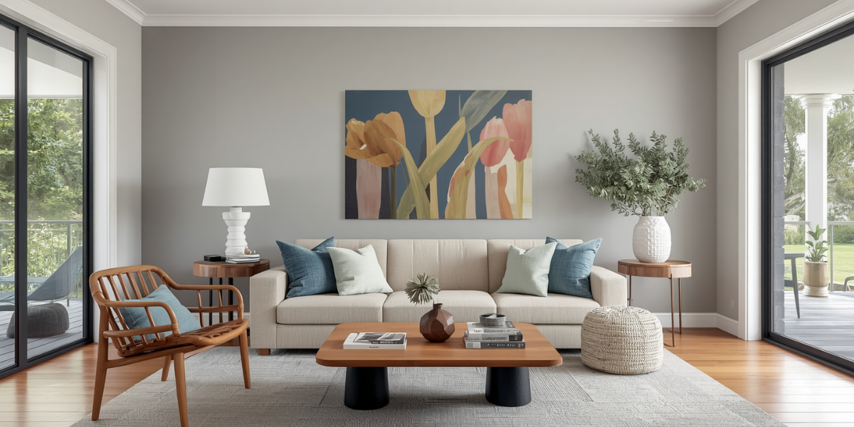
Interior Painting Trends for Wollongong Homes in 2026
The interior painting trends in Wollongong have shifted a lot this year. Interior paint trends in 2026 have moved significantly from the cool greys and stark whites that dominated the early 2020s. The shift is toward warmth, texture, and colours that feel connected to the natural environment — a direction that suits Wollongong and Illawarra homes particularly well given the landscape they sit in.
Here’s what’s actually working in interiors right now, and how it translates to homes in the Wollongong area. These are the interior painting trends in Wollongong we’re actually putting on walls right now.
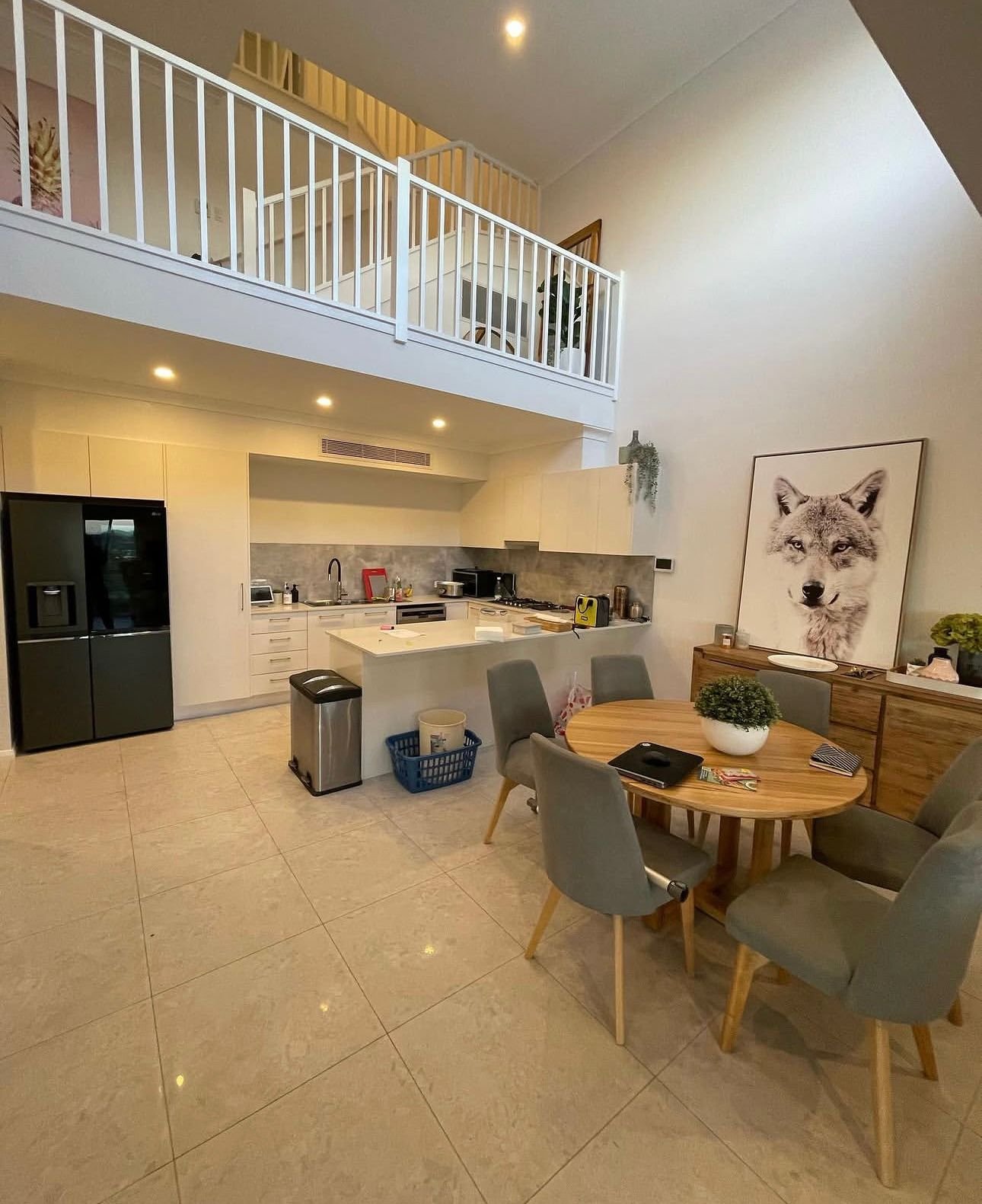
What’s Driving Interior Painting Trends in Wollongong
A few clear themes are shaping interior colour choices in 2026:
Warmth over coolness. The cool grey era is over. Homeowners have moved firmly toward warmer tones — off-whites, warm neutrals, muted greens, and earthy terracottas. The reasoning is simple: warm tones feel more liveable, more inviting, and age better than the trend-driven cool grey. This is one of the clearest interior painting trends in Wollongong right now.
Connection to nature. Colours that reference the natural world — sage greens, warm ochres, dusty pinks, warm sandy tones — are consistently popular. For Wollongong homes already surrounded by bushland, coastal views, and sandstone, this direction feels genuine rather than contrived. It’s a recurring theme in interior painting trends in Wollongong.
Personality in specific rooms. While open-plan living areas tend toward warm neutrals, 2026 sees more homeowners using bolder, more considered colours in bedrooms, studies, and feature applications. Not every-room-the-same bold — targeted, deliberate use of colour in the right spaces. Expect to see this in interior painting trends in Wollongong all year.
Room-by-Room Interior Painting Trends in Wollongong
Living and Dining Areas
The main living area is where most Wollongong homeowners play it safest — and smart, because this is the space that needs to work hardest for entertaining, family life, daily use, and eventually resale. It fits neatly with current interior painting trends in Wollongong.
Warm whites and off-whites continue to dominate. The specific products homeowners are gravitating toward in 2026: A practical pick within interior painting trends in Wollongong.
- Dulux Antique White USA — warm, classic, consistently popular in the Illawarra
- Taubmans Linen — slightly creamy, photographs beautifully in natural light
- Haymes Ivory Silk — just a step warmer than white, suits north-facing coastal rooms beautifully
Where homeowners are getting more adventurous: feature walls behind TV units and fireplaces using deep tones — charcoal, deep slate blue, or warm dark green. Done in a low-sheen finish, these create depth without overwhelming the room. This shapes a lot of the interior painting trends in Wollongong.
Bedrooms
Bedrooms in Wollongong homes are seeing a significant uptick in colour confidence. The most popular directions: It’s a smart move alongside interior painting trends in Wollongong.
Warm sage and eucalyptus green — calm, nature-connected, restful. These tones work particularly well in bedrooms that look out onto gardens or the Escarpment. Dulux Limed Green Quarter (subtle) through to Haymes Asparagus (more committed) covers this range.
Dusty pink and warm terracotta — warmer than people expect but genuinely restful in a bedroom context. Not bright or saturated — muted, earthy versions of these tones. Dulux Aged Rose Quarter or Taubmans Desert Dusk are good references.
Deep moody tones for master bedrooms — dark green, deep teal, or charcoal on all four walls in a master bedroom feels luxurious rather than oppressive when done at the right scale. More Wollongong homeowners are going for this in 2026, particularly in homes with generous natural light.
Kitchens
Kitchen walls in 2026 are mostly staying neutral — the kitchen itself provides enough visual interest through cabinetry, benchtops, and splashbacks. Semi-gloss in warm white or off-white is still the dominant choice for practical reasons: washability, brightness, and longevity.
Where colour appears in kitchens: cabinetry colour choices (which aren’t a painting job but influence the wall colour decision), and occasionally a feature wall on an island-facing or window-adjacent wall.
Important: In Wollongong’s humid coastal climate, kitchen walls need a semi-gloss or satin washable formula rather than a flat or low-sheen product. Flat paint in a kitchen is impractical — it can’t handle cleaning without marking.
Bathrooms
Bathrooms in 2026 Wollongong homes are moving away from the all-white tile-and-paint approach. More homeowners are using:
- Soft sage or warm grey on walls for a more considered feel
- White ceiling + coloured walls for a classic bathroom proportion
- Semi-gloss throughout — non-negotiable for moisture resistance in the Illawarra climate
The best bathroom paint for Wollongong’s humid conditions: Dulux Wash & Wear Kitchen & Bathroom, Taubmans 3 in 1 Kitchen & Bathroom, or equivalent semi-gloss with anti-mould properties.
Home Offices and Studies
The home office has become a proper room in most Wollongong homes rather than a converted corner. Colour choices here reflect the function:
- Blue-adjacent tones — muted blue or soft teal for calm focus
- Deep green — forest-adjacent tones that feel grounding and serious
- Warm off-white — clean, versatile, works with any desk setup
The sheen level for a home office: low-sheen is standard. Semi-gloss only if it’s a high-use family space rather than a dedicated office.
Sheen Level Guide for Wollongong Homes
Getting the sheen level right matters as much as the colour. Here’s a practical guide:
| Room | Recommended Sheen | Why |
|---|---|---|
| Living and dining areas | Low-sheen | Warm look, easy to touch up |
| Bedrooms | Low-sheen | Soft appearance, comfortable |
| Kitchen walls | Satin or semi-gloss | Washability for cooking splatter |
| Bathrooms | Semi-gloss | Moisture resistance, easy to clean |
| Laundry | Semi-gloss | Humidity and splash resistance |
| Hallways | Low-sheen to satin | Higher wear than bedrooms |
| Ceilings (all rooms) | Flat ceiling white | No reflectivity |
| Skirtings and doors | Semi-gloss or gloss | Durability and definition |
In Wollongong’s coastal conditions, erring toward satin or semi-gloss in any room with humidity exposure (kitchens, bathrooms, even well-used laundries) is the practical choice.
Feature Walls in 2026 — How to Get It Right
Feature walls are back — but done differently. What works in 2026:
- One deliberate wall, not a random accent. Usually behind a bed, a sofa, or a fireplace.
- Deeper, more sophisticated tones — charcoal, deep green, warm navy, dusty terracotta
- Low-sheen finish on feature walls — high-sheen feature walls look cheap and date fast
- Complementary palette — the feature wall should be a deeper or more saturated version of the room’s general palette, not a completely different colour
What doesn’t work: random bold walls that have no relationship to the rest of the room, or feature walls in busy spaces where the eye already has too much to process.
Planning an Interior Repaint for Your Wollongong Home?
At Colourland Painting, we work with homeowners across Wollongong, Thirroul, Austinmer, Bulli, and West Wollongong. We’re happy to advise on colour choices and product selection as part of any quoting process. Whatever interior painting trends in Wollongong you’re drawn to, we strongly prefer Dulux Wash&Wear inside — especially for families with kids, the walls wipe clean and stay fresh, and we’ve never seen a Dulux job fail even after 20 or 30 years. Phone 0421 755 294 for a free quote. For colour ideas, Dulux Australia is a good starting point.
- Interior painters Wollongong
- Residential painters Wollongong
- House painters Wollongong
- Contact us for a free quote