
Address: Wollongong NSW


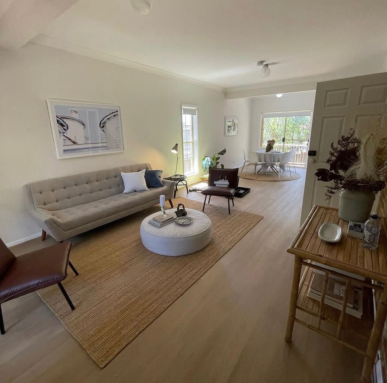
How to Choose Paint Colours: A Painter’s Guide
Choosing paint colours is the part everyone gets stuck on. People stand in the paint aisle with twenty swatches, completely overwhelmed — and then make the one mistake I see most often: they pick the colour under shop lights and never test it on their own wall. After 35-plus years painting homes across Wollongong and the Illawarra, I’ve watched how colours actually behave once they’re up: how they shift through the day, how the coastal light changes them, and how some shades hold while others fade fast. So here’s how to choose paint colours the way a painter would — practical, not just pretty.
Start with the light, not the swatch
When you’re working out how to choose paint colours, the single biggest factor is the light hitting them. A grey that looks crisp and cool in a south-facing room can turn flat and dull in a north-facing one. Near the coast we get a lot of bright, slightly blue natural light, and it pulls cool tones even cooler. So before you fall in love with a chip, look at where the room faces and how much sun it gets through the day.
My rule: always test big. Paint a swatch at least 30cm x 30cm directly on the wall — two coats — and live with it for a couple of days. Look at it in the morning, at midday and at night under your own lights. A little tester pot will save you from repainting a whole room because the colour “went purple” at dusk. It always comes down to undertones, and undertones only show up at full size on your own wall.
The Simple Rules for How to Choose Paint Colours
You don’t need a design degree to work out how to choose paint colours. A couple of guidelines do most of the heavy lifting:
- Keep the palette tight. Pick one main colour, one secondary, and one accent — that’s it. Three colours across a home (or an exterior) is plenty. More than that and it starts to feel busy.
- Let the big neutrals carry the house. Walls, ceilings and trim should be your calm base. Save the personality for an accent wall, a front door, or the soft furnishings you can change cheaply later.
- Match the sheen to the room. Flat or low-sheen hides wall imperfections and suits ceilings and low-traffic rooms; a washable low-sheen or satin is better for hallways, kids’ rooms and kitchens because you can wipe them.
- Work with what you can’t change. Your roof, brick, pavers and window frames all have undertones. Choose wall colours that sit with them, not against them.
Choosing exterior colours (and why they’re different)
Knowing how to choose paint colours outside is a different game, because the sun is brutal and it never lets up. Two things matter here that nobody tells you in the colour brochures.
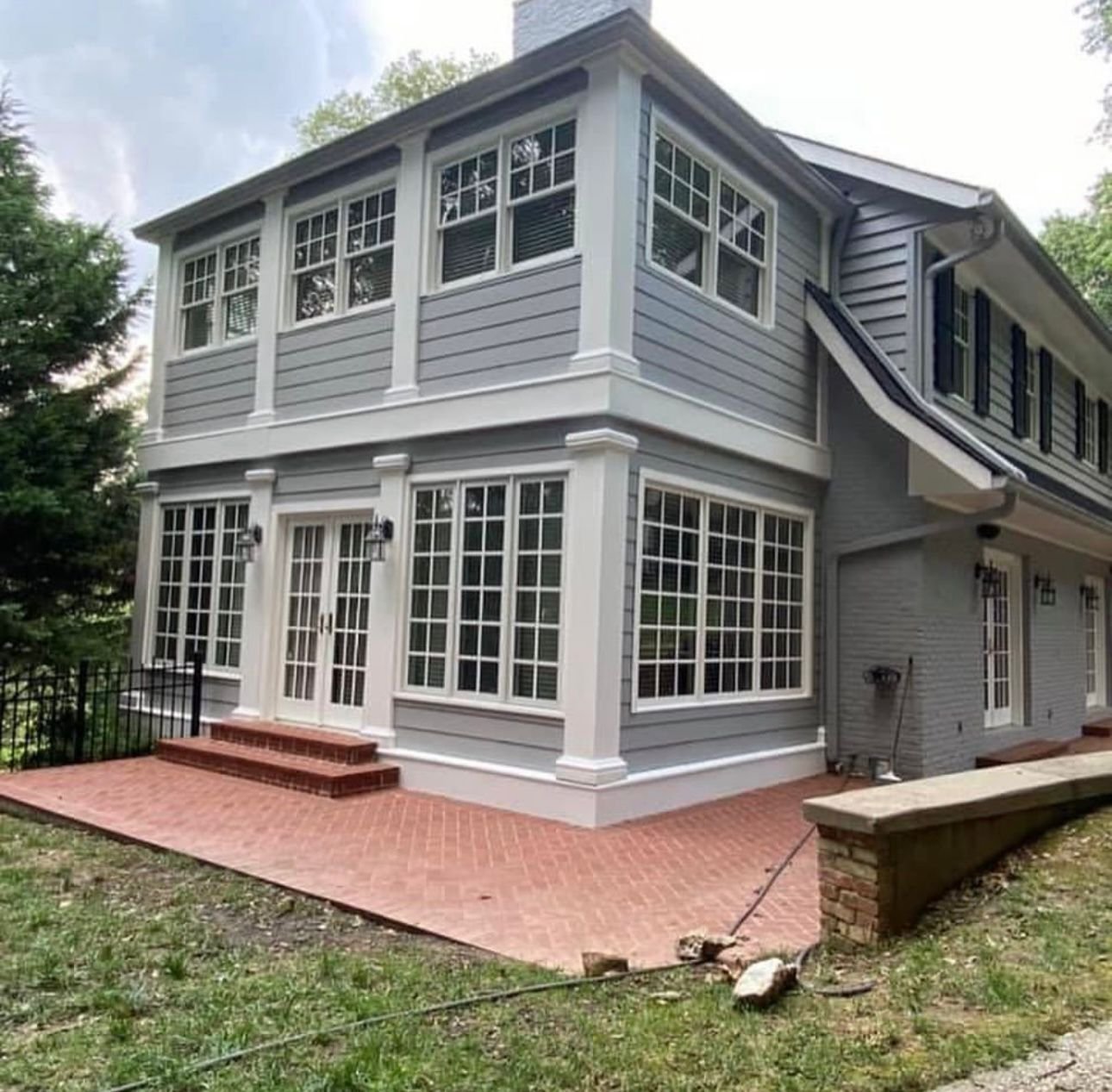
First, dark colours fade faster and run hotter. A deep charcoal or moody navy looks fantastic — and we paint plenty of them — but darker pigments absorb more heat and take more UV punishment, so they can shift over time more than a mid-tone or light colour. If you go dark, that’s exactly when the quality of the paint matters most. It’s worth reading our take on exterior paint durability before you commit to a bold shade, because the right product is what keeps that colour true.

Second, keep it to three colours and let the fixed elements guide you — roof, gutters, brick and any stone. A safe, timeless formula is a neutral base for the main walls, a contrasting trim (crisp white or a soft off-white works almost everywhere), and one accent for the front door or feature panel. If you’d like a hand pulling a scheme together for your place, that’s part of what our exterior painting service covers.
How to Choose Paint Colours Inside: Rooms Have Moods
When you’re deciding how to choose paint colours inside, you’ve got far more freedom because the colour isn’t fighting the weather. Think about how you want each room to feel. Warm tones — soft whites with a hint of warmth, muted earthy shades — make living areas and bedrooms feel cosy. Cooler tones can feel fresh and calm in bathrooms and studies, but in a room that’s already cold and north-facing, a cool grey can tip into clinical. Flow matters too: you don’t need the same colour everywhere, but the palette should feel like it belongs to the one home as you move through it.
Whites deserve a special mention because there’s no such thing as “just white.” Every white has an undertone — warm, cool or neutral — and it’ll read completely differently against your floors and light. Test three or four whites side by side; the right one usually becomes obvious once they’re up together. For inspiration on current schemes, the Dulux colour library is a good starting point, but always bring it back to a tester on your own wall. When you’re ready to bring it to life, our interior painting team can help.
Frequently asked questions
How do I choose the right paint colour?
Start with the light in the room and the things you can’t change — floors, roof, brick. Test a large swatch (at least 30cm) on your own wall in two coats, and look at it morning, midday and night before deciding. Undertones only reveal themselves at full size in your own light.
How many colours should I use in a house?
Keep it tight — one main colour, one secondary and one accent. Three across the home (or the exterior) is plenty. Let neutrals carry the bulk and save bold colour for accents you can change cheaply.
Do dark exterior colours fade faster?
They can. Darker pigments absorb more heat and take more UV, so they can shift more over time than lighter shades. Dark schemes look great, but they’re exactly where a top-quality exterior paint pays off to keep the colour true.
What’s the best white paint for walls?
There’s no single best white — it depends on your light and finishes. Every white has a warm, cool or neutral undertone. Test three or four side by side on your wall and the right one for your space usually stands out.
Should ceilings and trim be a different colour?
Usually yes. A flat white or off-white ceiling and a crisp trim give walls a clean frame. Trim in a slightly different white or low-sheen also handles knocks and cleaning better than flat wall paint.
Not sure which way to go? We’ll help
Knowing how to choose paint colours is easier with someone who’s seen how they age on real homes. If you’d like a hand picking a scheme that suits your home and our coastal light — and that will still look right in ten years — get a free quote from Colourland Painting. Phone 0421 755 294 or visit our contact page, and you can see more about us on the Colourland Painting homepage.